9  ggplot 2.0

9.1 Learning Objectives

  • Analyzing California Wildfire Data
  • More on Data Visualization
    • Bar Chart
      • coord_flip(): Flip the x and y axes to create a horizontal bar chart.
      • gemo_text(): Add text labels to the bars, with the vjust and hjust arguments to adjust the position of the labels.
    • Line Chart 2.0
      • geom_line(): Connect data points with lines.
      • facet_wrap(): Create multiple plots based on a categorical variable.

9.2 Load Packages and Data

library(tidyverse)
── Attaching core tidyverse packages ──────────────────────── tidyverse 2.0.0 ──
✔ dplyr     1.1.2     ✔ readr     2.1.4
✔ forcats   1.0.0     ✔ stringr   1.5.0
✔ ggplot2   3.4.2     ✔ tibble    3.2.1
✔ lubridate 1.9.2     ✔ tidyr     1.3.0
✔ purrr     1.0.2     
── Conflicts ────────────────────────────────────────── tidyverse_conflicts() ──
✖ dplyr::filter() masks stats::filter()
✖ dplyr::lag()    masks stats::lag()
ℹ Use the conflicted package (<http://conflicted.r-lib.org/>) to force all conflicts to become errors
load("data/wildfire.RData")

After loading the data, you should see a data frame called df_clean in your environment.

9.3 Data Exploration

We can use the glimpse() function to get a quick overview of the data.

Note

glimpse() is a function from the dplyr package that provides a concise summary of a data frame.

glimpse(df_clean)
Rows: 100
Columns: 11
$ id             <chr> "INC1000", "INC1001", "INC1002", "INC1003", "INC1004", …
$ date           <date> 2020-11-22, 2021-09-23, 2022-02-10, 2021-05-17, 2021-0…
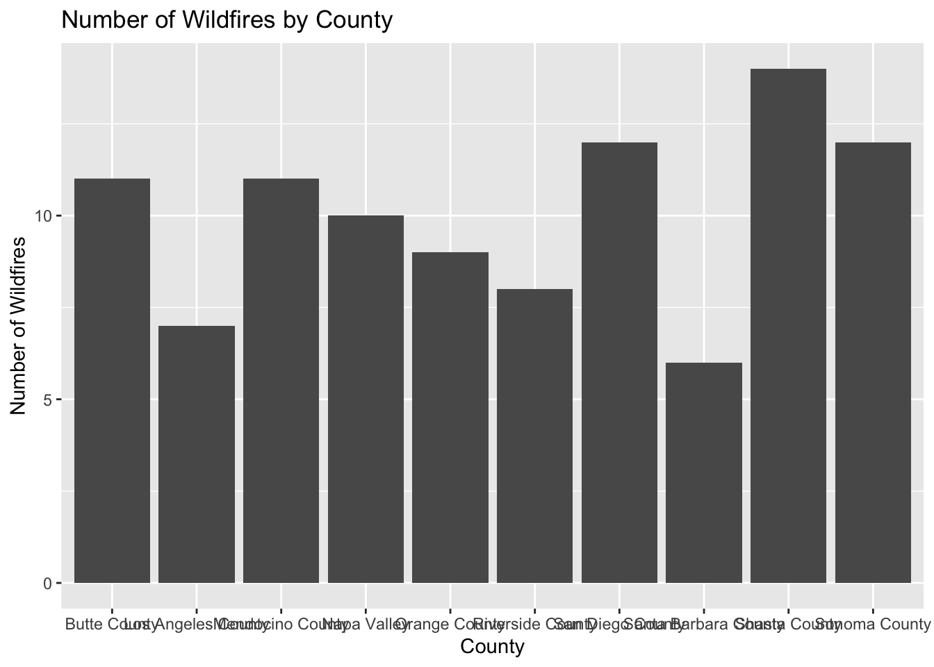
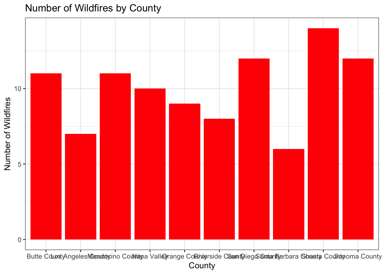
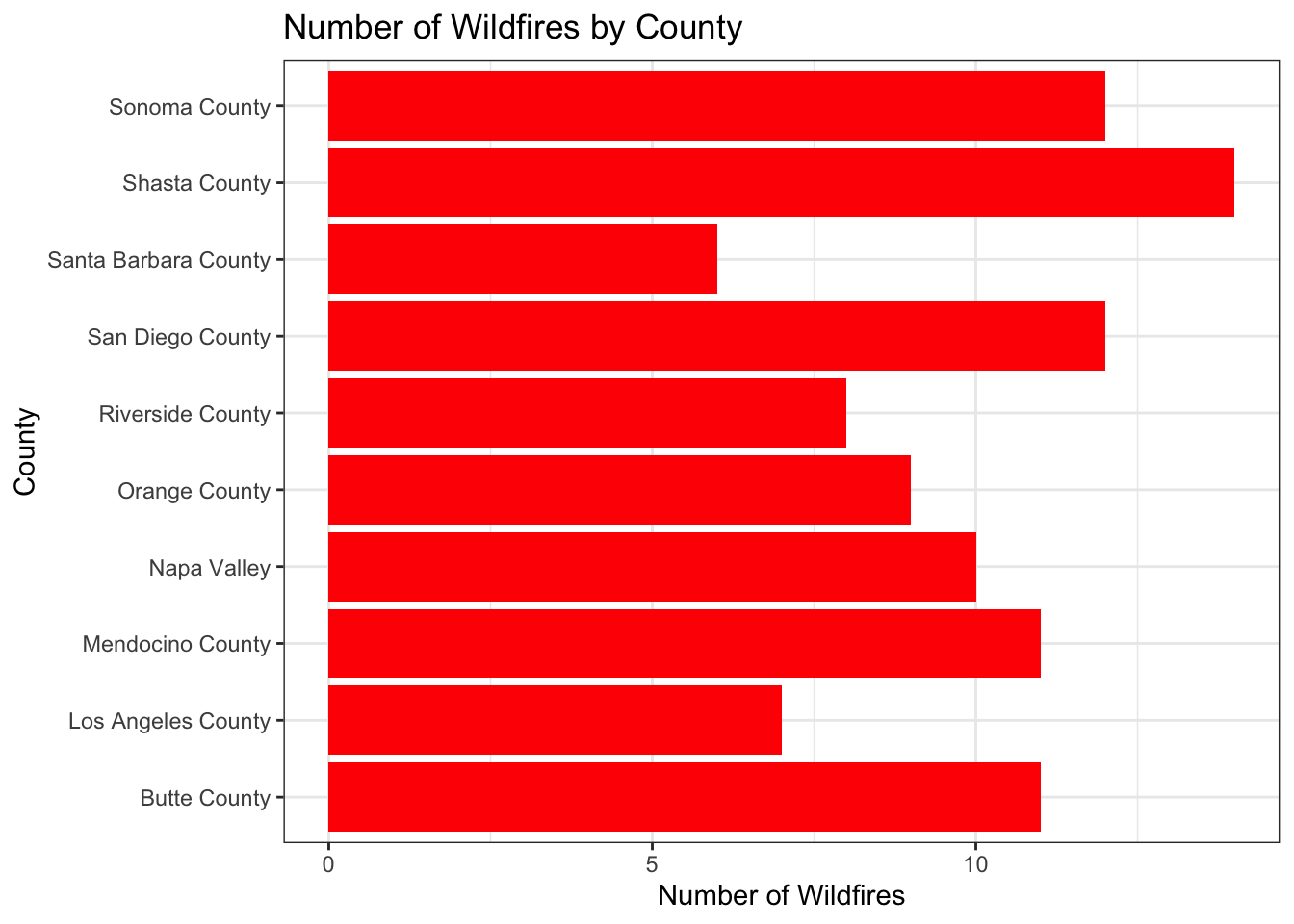
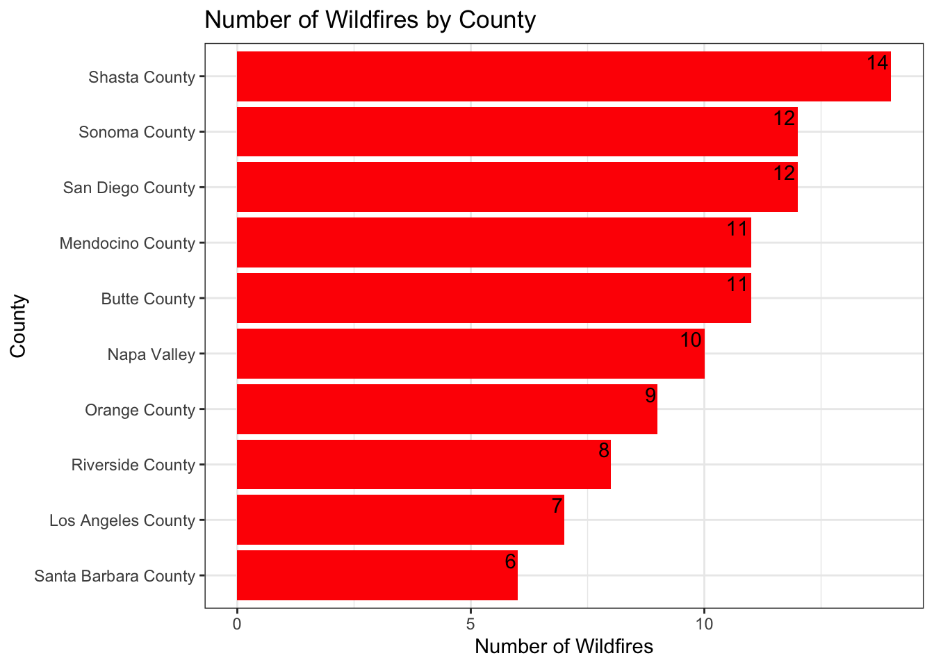
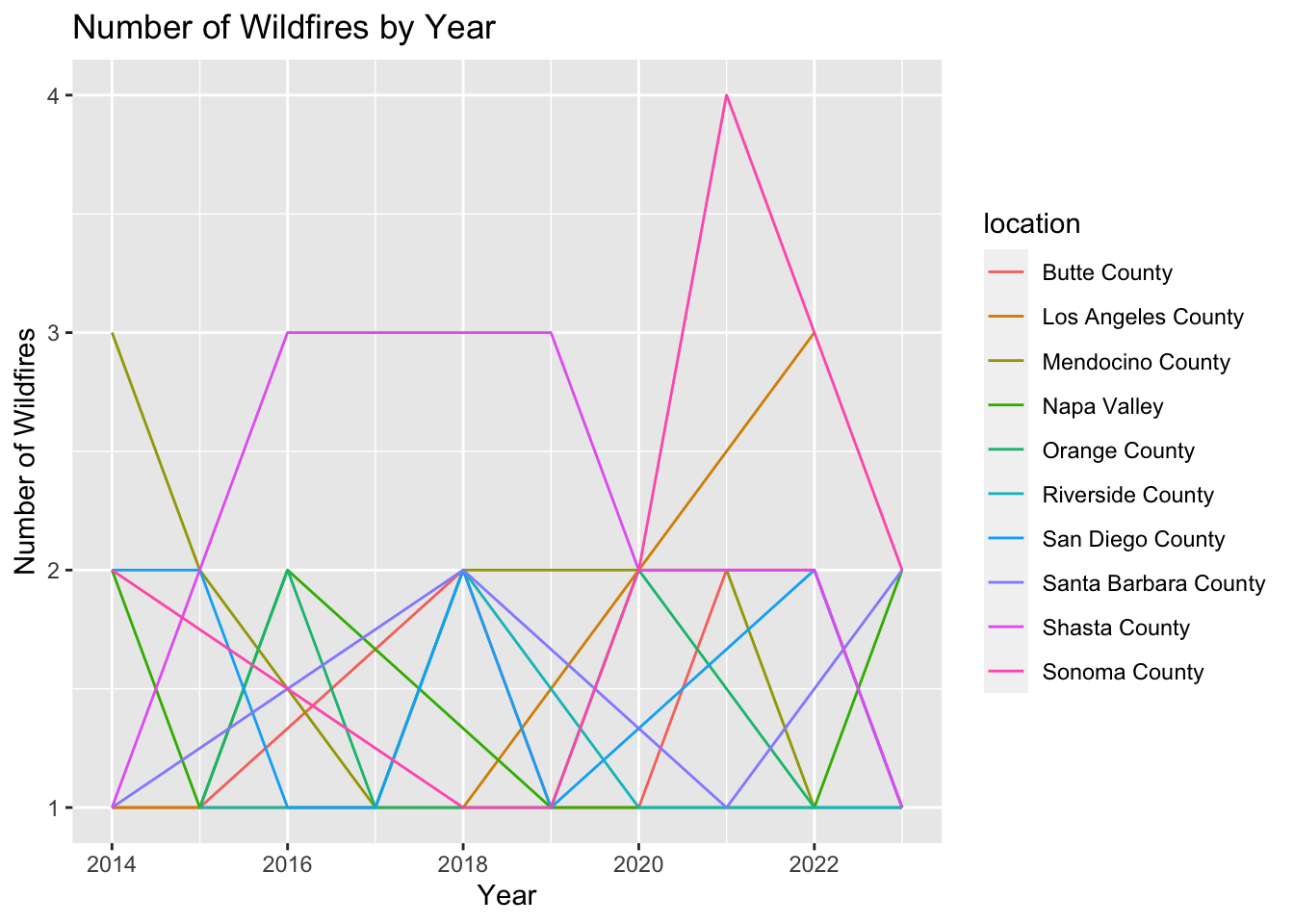
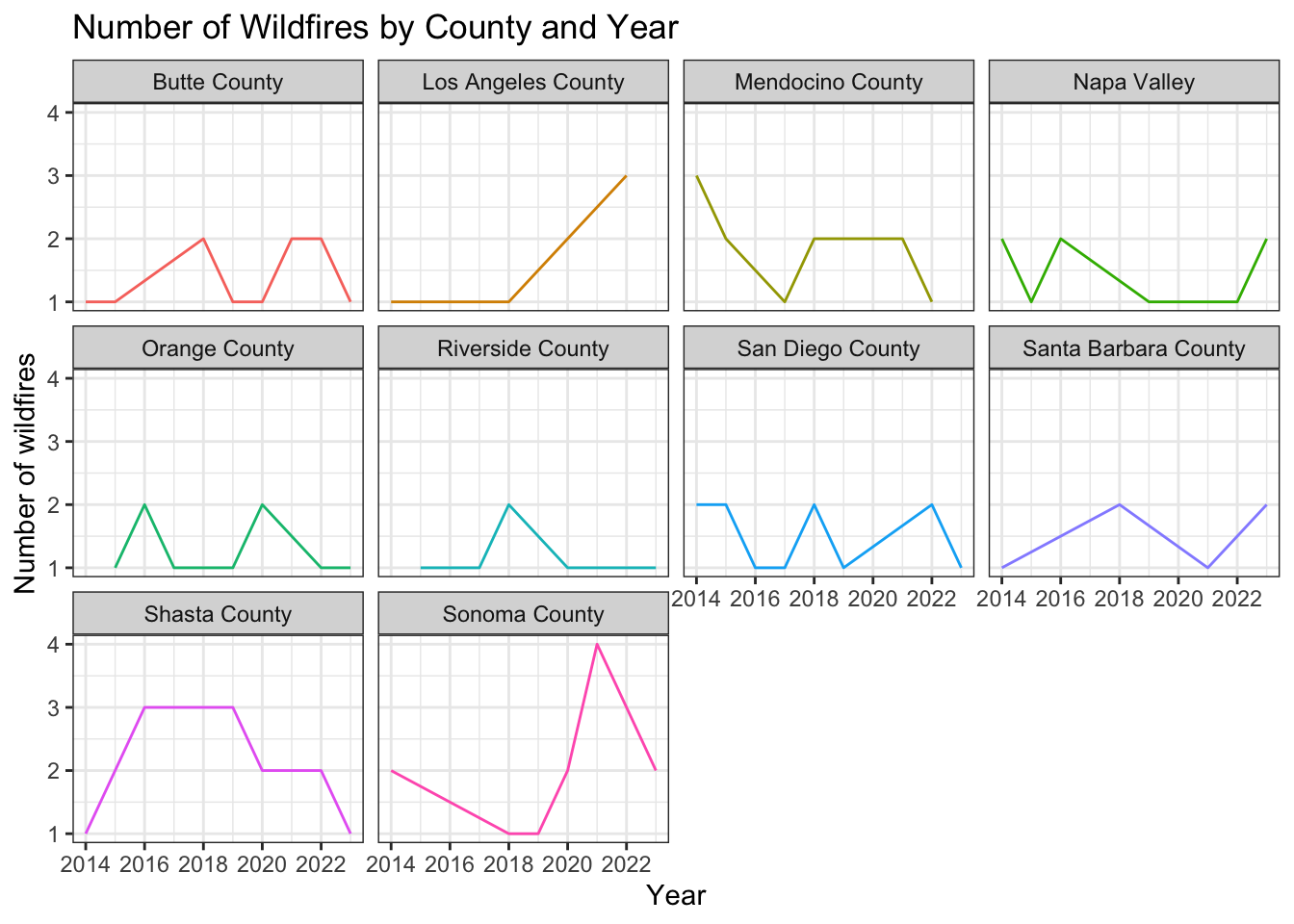
$ location       <chr> "Sonoma County", "Sonoma County", "Shasta County", "Son…
$ area           <dbl> 14048, 33667, 26394, 20004, 40320, 48348, 16038, 24519,…
$ homes          <dbl> 763, 1633, 915, 1220, 794, 60, 1404, 121, 299, 275, 623…
$ businesses     <dbl> 474, 4, 291, 128, 469, 205, 137, 28, 264, 196, 41, 183,…
$ vehicles       <dbl> 235, 263, 31, 34, 147, 21, 64, 125, 208, 153, 143, 78, …
$ injuries       <dbl> 70, 100, 50, 28, 0, 58, 13, 0, 33, 41, 58, 12, 32, 16, …
$ fatalities     <dbl> 19, 2, 6, 0, 15, 2, 11, 5, 4, 2, 17, 18, 19, 8, 16, 19,…
$ financial_loss <dbl> 2270.57, 1381.14, 2421.96, 3964.16, 1800.09, 4458.29, 7…
$ cause          <chr> "Lightning", "Lightning", "Human Activity", "Unknown", …

9.4 Data Analysis

Questions to Answer

Here we will analyze the data to answer the following questions:

  • Q1: Top 5 counties with the highest number of wildfires?
  • Q2: Top 5 counties with the highest average burnt areas?
  • Q3: How does the number of wildfires change over the years for each county?

Q1: Top Counties with the Highest Number of Wildfires

Method 1: group_by() and summarize()

To answer this question, we can first try the group_by() and summarize() functions to count the number of wildfires by county.

df_clean |>
  group_by(location) |>
  summarize(num_of_wildfires = n()) |>
  arrange(desc(num_of_wildfires))

Method 2: count()

We can also use the count() function to achieve the same result, which is more concise.

df_clean |>
  count(location) |>
  arrange(desc(n))

Q2: Top 5 counties with the highest average burnt areas?

df_clean |>
  group_by(location) |>
  summarize(avg_burnt_area = mean(area)) |>
  arrange(desc(avg_burnt_area))

Q3: How does the average burnt area change over the years for each county?

First, we need want to translate this question to a data analysis task: calculate the number of wildfires by year for each county. That means, we need to group the data by location and year, and then compute average burnt area for each group.

Note that the original dataframe doesn’t have a year column. We need to extract the year from the date column. Here we can use the year() function from the lubridate package to extract the year from the date column.

df_clean |>
  group_by(location, year = year(date)) |>
  summarize(avg_burnt_area = mean(area, na.rm = TRUE)) 
`summarise()` has grouped output by 'location'. You can override using the
`.groups` argument.

9.5 Data Visualization

Bar Chart: Number of Wildfires by County

We chose to use a bar chart to visualize the number of wildfires by county because it is a good way to compare the number of wildfires (numeric) across different counties (categorical).

We start by counting the number of wildfires by county using the count() function, and then create a bar chart using ggplot(). Remember the key componenets of a bar chart:

  • Data: The data frame with the variables to be plotted.
  • ggplot(aes(x, y)): The mapping between the data and the visual properties of the plot.
  • geom_col(): The geometric object for a bar chart.
  • labs(): The labels for the title, x-axis, and y-axis.
df_clean |>
  count(location) |>
  ggplot(aes(x = location, y = n)) +
  geom_col() +
  labs(title = "Number of Wildfires by County",
       x = "County",
       y = "Number of Wildfires")

Then, we can add more customization to the plot, such as changing the fill color (geom_col(fill = "red")), using a different theme(`theme_bw``).

df_clean |>
  count(location) |>
  ggplot(aes(x = location, y = n)) +
  geom_col(fill = "red") + 
  labs(title = "Number of Wildfires by County",
       x = "County",
       y = "Number of Wildfires") +
  theme_bw() 

Because the county names are long, we can use coord_flip() to flip the x and y axes to create a horizontal bar chart.

df_clean |>
  count(location) |>
  ggplot(aes(x = location, y = n)) +
  geom_col(fill = "red") +
  labs(title = "Number of Wildfires by County",
       x = "County",
       y = "Number of Wildfires") +
  theme_bw() +
  coord_flip()

Then, we may want to reorder the bars by the number of wildfires. We can use the fct_reorder() function from the forcats package to reorder the bars by the number of wildfires.

df_clean |>
  count(location) |>
  ggplot(aes(x = fct_reorder(location, n), y = n)) +
  geom_col(fill = "red") +
  labs(title = "Number of Wildfires by County",
       x = "County",
       y = "Number of Wildfires") +
  theme_bw() +
  coord_flip()

Finally, we can add text labels to the bars using the geom_text() function, with the vjust and hjust arguments to adjust the position of the labels.

df_clean |>
  count(location) |>
  ggplot(aes(x = fct_reorder(location, n), y = n)) +
  geom_col(fill = "red") +
  labs(title = "Number of Wildfires by County",
       x = "County",
       y = "Number of Wildfires") +
  theme_bw() +
  coord_flip() +
  geom_text(aes(label = n), vjust = 0, hjust = 1.1)

Let’s put all the code together:

df_clean |>
1  count(location) |>
2  ggplot(aes(x = fct_reorder(location, n), y = n)) +
3  geom_col(fill = "red") +
  labs(title = "Number of Wildfires by County",
       x = "County",
4       y = "Number of Wildfires") +
5  theme_bw() +
6  coord_flip() +
7  geom_text(aes(label = n), vjust = -0.5, hjust = 1.1)
1
Count the number of wildfires by county.
2
Map the county names to the x-axis and the number of wildfires to the y-axis.
3
Create a bar chart with red bars.
4
Add labels for the title, x-axis, and y-axis.
5
Use a black-and-white theme.
6
Flip the x and y axes to create a horizontal bar chart.
7
Add text labels to the bars.

Line Plot: Number of Wildfires by Year for Each County

We chose to use a line plot to visualize the number of wildfires by year for each county because it is a good way to show trends over time.

Let’s start by calculating the number of wildfires by year for each county using the group_by() and summarize() functions.

df_clean |>
  count(location, year = year(date))

Then, we can create a line plot using ggplot(). Remember the key components of a line plot: - Data: The data frame with the variables to be plotted. - ggplot(aes(x, y)): The mapping between the data and the visual properties of the plot. - geom_line(): The geometric object for a line plot. - labs(): The labels for the title, x-axis, and y-axis.

Since we want to show the number of wildfires by year for each county, we can map the year to the x-axis, the number of wildfires n to the y-axis, and the county names (location) to the color.

df_clean |>
  count(location, year = year(date)) |>
  ggplot(aes(x = year, y = n, color = location)) +
  geom_line() +
  labs(title = "Number of Wildfires by Year",
       x = "Year",
       y = "Number of Wildfires")

As we see the plot, it is not very informative because there are too many counties. We can use the facet_wrap() function to create multiple plots based on the location variable, and remove the legend using theme(legend.position = "none"), also, we can change the theme to theme_bw().

df_clean |>
  count(location, year = year(date)) |>
1  ggplot(aes(x = year, y = n, color = location)) +
2  geom_line() +
  labs(title = "Number of Wildfires by County and Year",
       x = "Year",
3       y = "Number of wildfires") +
4  theme_bw() +
5  facet_wrap(~location) +
6  theme(legend.position = "none")
1
Map the year to the x-axis, the number of wildfires to the y-axis, and the county names to the color.
2
Create a line plot.
3
Add labels for the title, x-axis, and y-axis.
4
Use a black-and-white theme.
5
Create multiple plots based on the county names.
6
Remove the legend.

9.6 Plotly: Interactive Data Visualization

We can use the plotly package to create interactive data visualizations. Here we will create an interactive bar chart to show the number of wildfires by county.

library(plotly)

Attaching package: 'plotly'
The following object is masked from 'package:ggplot2':

    last_plot
The following object is masked from 'package:stats':

    filter
The following object is masked from 'package:graphics':

    layout

Interactive Bar Chart

p1 <- df_clean |>
  count(location) |>
  ggplot(aes(x = location, y = n)) +
  geom_col(fill = "red") +
  labs(title = "Number of Wildfires by County",
       x = "County",
       y = "Number of Wildfires") +
  theme_bw() +
  coord_flip() 

ggplotly(p1)

Interactive Line Plot

p2 <- df_clean |>
  count(location, year = year(date)) |>
  ggplot(aes(x = year, y = n, color = location)) +
  geom_line() +
  labs(title = "Number of Wildfires by Year",
       x = "Year",
       y = "Number of Wildfires") +
  theme_classic()

ggplotly(p2)

More on plotly

We can also create an interactive scatter plot to show the financial losses from wildfires in California. We can map the date to the x-axis, the financial_loss to the y-axis, the cause to the color, and create a tooltip with additional information.

p3 <- df_clean |>
  ggplot(aes(x = date, y = financial_loss, color = cause, text = paste(
    "Date:", date,
    "<br>Location:", location,
    "<br>Area Burned:", area, "acres",
    "<br>Homes Destroyed:", homes,
    "<br>Businesses Affected:", businesses,
    "<br>Vehicles Destroyed:", vehicles,
    "<br>Fatalities:", fatalities
1  ))) +
2  geom_point(size = 2) +
  labs(title = "Financial Losses from Wildfires in California",
       x = "Date",
       y = "Financial Loss ($)",
3       color = "Cause of Wildfire") +
4  theme_minimal()

ggplotly(p3, tooltip = "text")
1
Map the date to the x-axis, the financial_loss to the y-axis, the cause to the color, and create a tooltip with additional information. <br> means a line break.
2
Create a scatter plot.
3
Add labels for the title, x-axis, y-axis, and color.
4
Use a minimal theme.

9.7 Save the Plots

To save a plot as an image file, we can use the ggsave() function. Here we will save the bar chart as a PNG file with a width of 8 inches, a height of 6 inches, and a resolution of 300 dpi.

ggsave("bar_chart.png", p1, width = 8, height = 6, dpi = 300)