── Attaching core tidyverse packages ──────────────────────── tidyverse 2.0.0 ──
✔ dplyr     1.1.4     ✔ readr     2.1.5
✔ forcats   1.0.1     ✔ stringr   1.6.0
✔ ggplot2   4.0.0     ✔ tibble    3.3.0
✔ lubridate 1.9.4     ✔ tidyr     1.3.1
✔ purrr     1.2.0
── Conflicts ────────────────────────────────────────── tidyverse_conflicts() ──
✖ dplyr::filter() masks stats::filter()
✖ dplyr::lag()    masks stats::lag()
ℹ Use the conflicted package (<http://conflicted.r-lib.org/>) to force all conflicts to become errors
library(sf) # For spatial data operations
Linking to GEOS 3.13.0, GDAL 3.8.5, PROJ 9.5.1; sf_use_s2() is TRUE
library(rnaturalearth) # For world map dataload("out/expectancy_merged.RData")
10.2 Overview of Life Expectancy
Here let’s start by looking at the summary statistics of worldwide life expectancy in the most recent year available (2022).
# Summary statistics of worldwide life expectancy in 2022df_merge |>st_drop_geometry() |>filter(year ==2022) |>summarise(mean_life_expectancy =mean(life_expectancy),median_life_expectancy =median(life_expectancy),min_life_expectancy =min(life_expectancy),max_life_expectancy =max(life_expectancy))
Top 10 Countries/Regions with Highest Life Expectancy
# Top 10 countries with the highest life expectancy in 2022df_merge |>st_drop_geometry() |>filter(year ==2022) |>arrange(desc(life_expectancy)) |>head(10)
10.3 Data Visualization
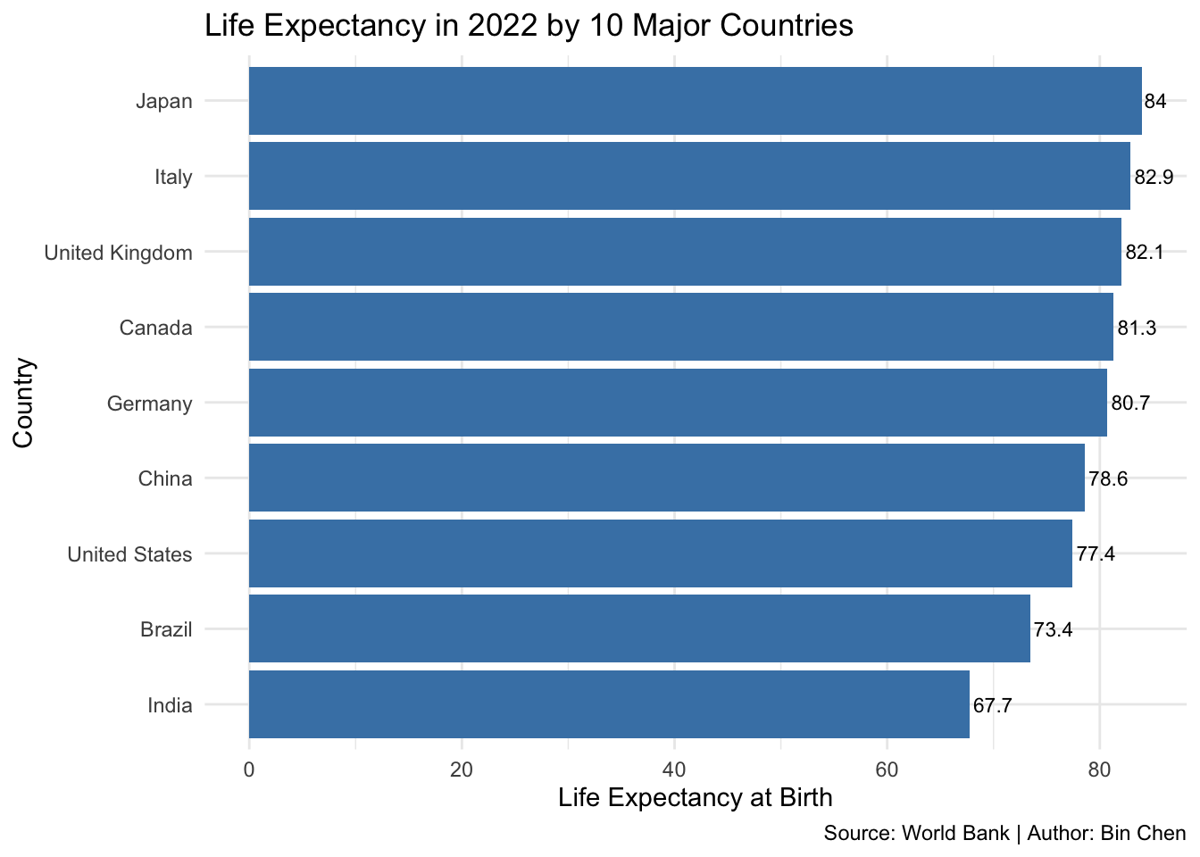
Bar Plot: Life Expectancy in 2022 by 10 Major Countries
# List of 10 major countries (with highest GDP)country_list <-c("United States", "China", "Japan", "Germany", "India", "United Kingdom", "France", "Brazil", "Italy", "Canada")
df_merge |>st_drop_geometry() |>filter(year ==2022) |>filter(country %in% country_list) |>ggplot(aes(x =reorder(country, life_expectancy), y = life_expectancy)) +geom_col(fill ="steelblue") +coord_flip() +labs(title ="Life Expectancy in 2022 by 10 Major Countries",x ="Country",y ="Life Expectancy at Birth",fill ="Country",caption ="Source: World Bank | Author: Bin Chen") +geom_text(aes(label =round(life_expectancy, 1)), hjust =-0.1, size =3) +theme_minimal()
Ignoring unknown labels:
• fill : "Country"
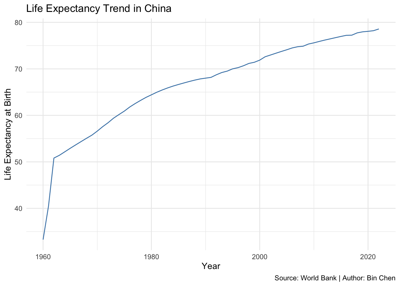
Line Plot: Life expectancy trend in China
# Life expectancy trend in Chinadf_merge |>st_drop_geometry() |>filter(country =="China") |>ggplot(aes(x = year, y = life_expectancy)) +geom_line(color ="steelblue") +labs(title ="Life Expectancy Trend in China",x ="Year",y ="Life Expectancy at Birth",caption ="Source: World Bank | Author: Bin Chen") +theme_minimal()
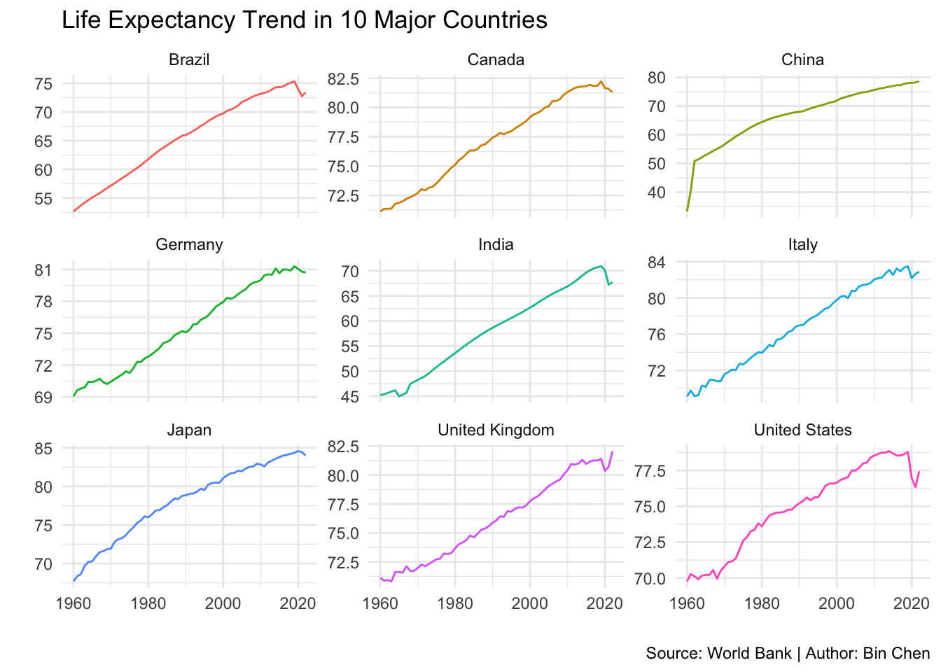
Multiple Lines
# Life expectancy trend in the 10 major countriesdf_merge |>st_drop_geometry() |>filter(country %in% country_list) |>ggplot(aes(x = year, y = life_expectancy, color = country)) +geom_line() +labs(title ="Life Expectancy Trend in 10 Major Countries",x =" ",y =" ",caption ="Source: World Bank | Author: Bin Chen") +theme_minimal() +facet_wrap(~country, scales ="free_y") +theme(legend.position ="none")
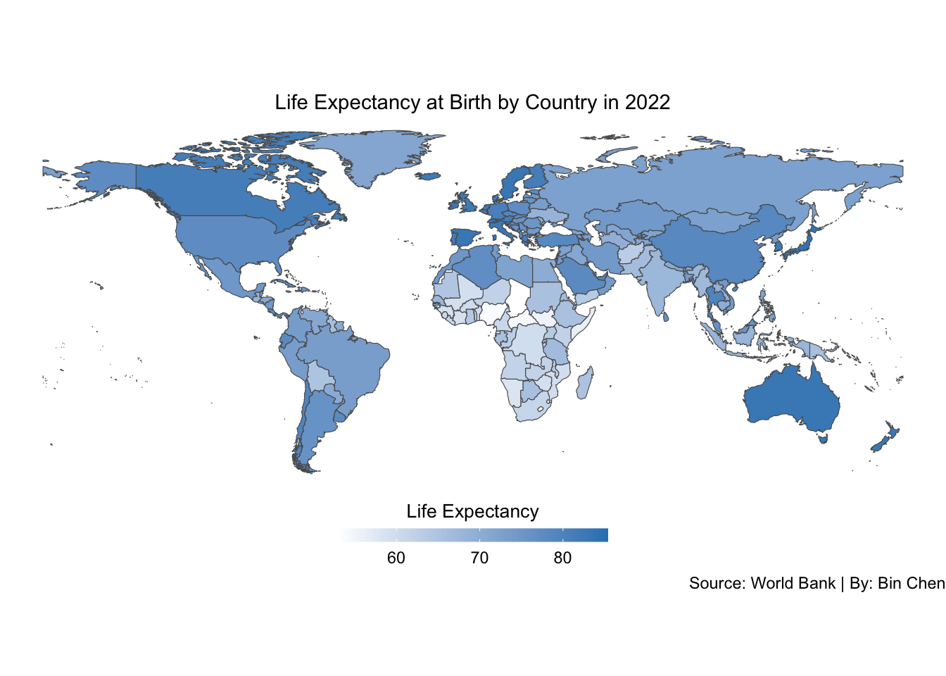
Map Plot: Life Expectancy by Country in 2022
# Map of life expectancy by country in 2022df_merge |>filter(year ==2022) |>1ggplot(aes()) +2geom_sf(aes(geometry = geometry, fill = life_expectancy)) +scale_fill_gradient(low ="white",high ="#3182bd",na.value ="grey90",name ="Life Expectancy",guide =guide_colorbar(barwidth =10,barheight =0.5,title.position ="top",title.hjust =0.53 )) +labs(title ="Life Expectancy at Birth by Country in 2022",fill ="Life Expectancy at Birth",4caption ="Source: World Bank | By: Bin Chen") +5theme_void() +theme(legend.position ="bottom",legend.title =element_text(size =10),6plot.title =element_text(hjust =0.5, size =11))
1
Set up the plot.
2
Create a spatial feature plot using the world map geometry and fill color based on life expectancy.
3
Set the color gradient for life expectancy.
4
Add titles and captions.
5
Remove the background.
6
Adjust the legend position and title size.
10.4 Key Functions Recap
Function
Package
Purpose
Example Use
st_drop_geometry()
sf
Remove spatial geometry from sf object
df_merge \| st_drop_geometry()
geom_sf()
ggplot2
Plot spatial features (map geometries)
geom_sf(aes(geometry = geometry, fill = life_expectancy))
scale_fill_gradient()
ggplot2
Create gradient color scale for fill
scale_fill_gradient(low = "white", high = "#3182bd", na.value = "grey90")