read_csv() |
readr |
Read CSV files into R |
read_csv("data/hot100.csv") |
str() |
Base R |
Display data structure and types |
str(df) |
summary() |
Base R |
Generate summary statistics |
summary(hot100$date) |
summarise_all() |
dplyr |
Apply summary function to all columns |
summarise_all(~sum(is.na(.))) |
is.na() |
Base R |
Test for missing values |
is.na(df) |
rename() |
dplyr |
Rename columns in a data frame |
rename(date = Date, song = Song) |
mutate() |
dplyr |
Create or modify columns |
mutate(weeks_in_charts = as.numeric(weeks_in_charts)) |
as.numeric() |
Base R |
Convert values to numeric type |
as.numeric(weeks_in_charts) |
filter() |
dplyr |
Filter rows based on conditions |
filter(rank == 1, year(date) >= 2015) |
distinct() |
dplyr |
Return distinct rows |
distinct(artist, song) |
group_by() |
dplyr |
Group data by one or more variables |
group_by(artist) |
summarise() |
dplyr |
Compute summary statistics for groups |
summarise(n = n()) |
arrange() |
dplyr |
Sort rows by one or more columns |
arrange(-appearance) |
count() |
dplyr |
Count occurrences of unique values |
count(artist, sort = TRUE) |
slice_head() |
dplyr |
Select first n rows from each group |
slice_head(n = 10) |
head() |
Base R |
Get first n rows of data |
head(10) |
table() |
Base R |
Build contingency table of counts |
table(hot100$artist) |
sort() |
Base R |
Sort vector elements |
sort(decreasing = TRUE) |
year() |
lubridate |
Extract year component from date |
year(date) |
ggplot() |
ggplot2 |
Create a new ggplot object |
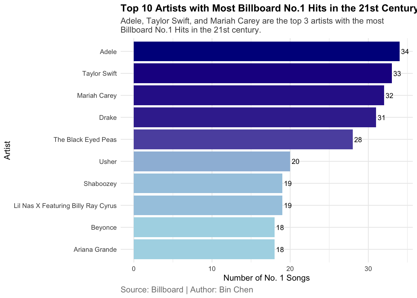
ggplot(aes(x = artist, y = appearance)) |
aes() |
ggplot2 |
Specify aesthetic mappings (x, y, color, fill) |
aes(x = reorder(artist, appearance), y = appearance, fill = appearance) |
geom_col() |
ggplot2 |
Create a bar chart |
geom_col(show.legend = FALSE) |
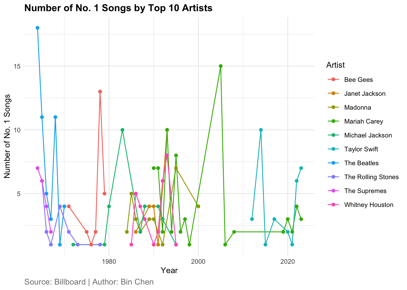
geom_line() |
ggplot2 |
Create a line plot |
geom_line() |
geom_point() |
ggplot2 |
Add points to a plot |
geom_point() |
geom_text() |
ggplot2 |
Add text labels to a plot |
geom_text(aes(label = appearance), hjust = -0.2, size = 3) |
coord_flip() |
ggplot2 |
Flip x and y axes |
coord_flip() |
scale_fill_gradient() |
ggplot2 |
Create gradient color scale for fill |
scale_fill_gradient(low = "lightblue", high = "darkblue") |
labs() |
ggplot2 |
Add titles, labels, and captions |
labs(title = "...", x = "Artist", y = "Number of No. 1 Songs") |
str_wrap() |
stringr |
Wrap long strings for display |
str_wrap("Adele, Taylor Swift, and Mariah Carey are the top 3 artists...") |
theme_minimal() |
ggplot2 |
Apply minimal theme |
theme_minimal(base_size = 10) |
element_text() |
ggplot2 |
Customize text elements in themes |
element_text(face = "bold", size = 12) |
theme() |
ggplot2 |
Customize plot appearance |
theme(plot.title = element_text(face = "bold", size = 12)) |
reorder() |
Base R |
Reorder levels of a variable |
reorder(artist, appearance) |