read_csv() |
readr |
Read CSV files into R |
read_csv("data/medallists.csv") |
colnames() |
Base R |
Get or set column names of a matrix or data frame |
colnames(df) |
select() |
dplyr |
Select specific columns |
select(name, gender, country, medal_type) |
glimpse() |
dplyr |
Get quick overview of data frame structure |
glimpse(df_clean) |
group_by() |
dplyr |
Group data by one or more variables |
group_by(country) |
summarise() |
dplyr |
Compute summary statistics for groups |
summarise(medallist_count = n()) |
arrange() |
dplyr |
Sort rows by one or more columns |
arrange(desc(medallist_count)) |
filter() |
dplyr |
Filter rows based on conditions |
filter(medal_type == "Gold Medal") |
head() |
Base R |
Get first n rows of data |
head(10) |
mutate() |
dplyr |
Create or modify columns |
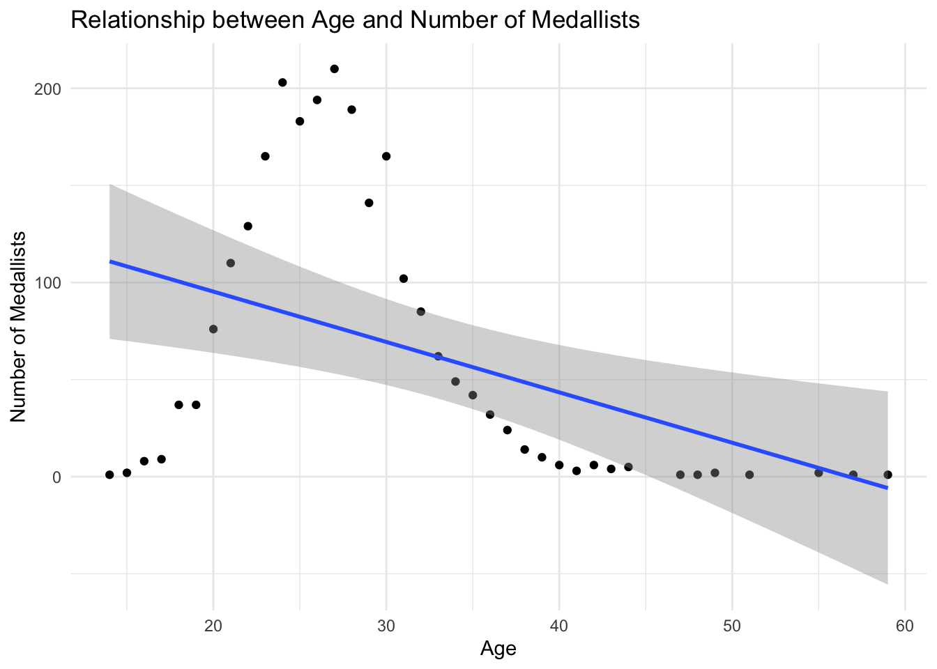
mutate(age = 2024 - year(birth_date)) |
year() |
lubridate |
Extract year component from date |
year(birth_date) |
is.na() |
Base R |
Test for missing values |
is.na(age) == FALSE |
left_join() |
dplyr |
Merge datasets keeping all rows from left table |
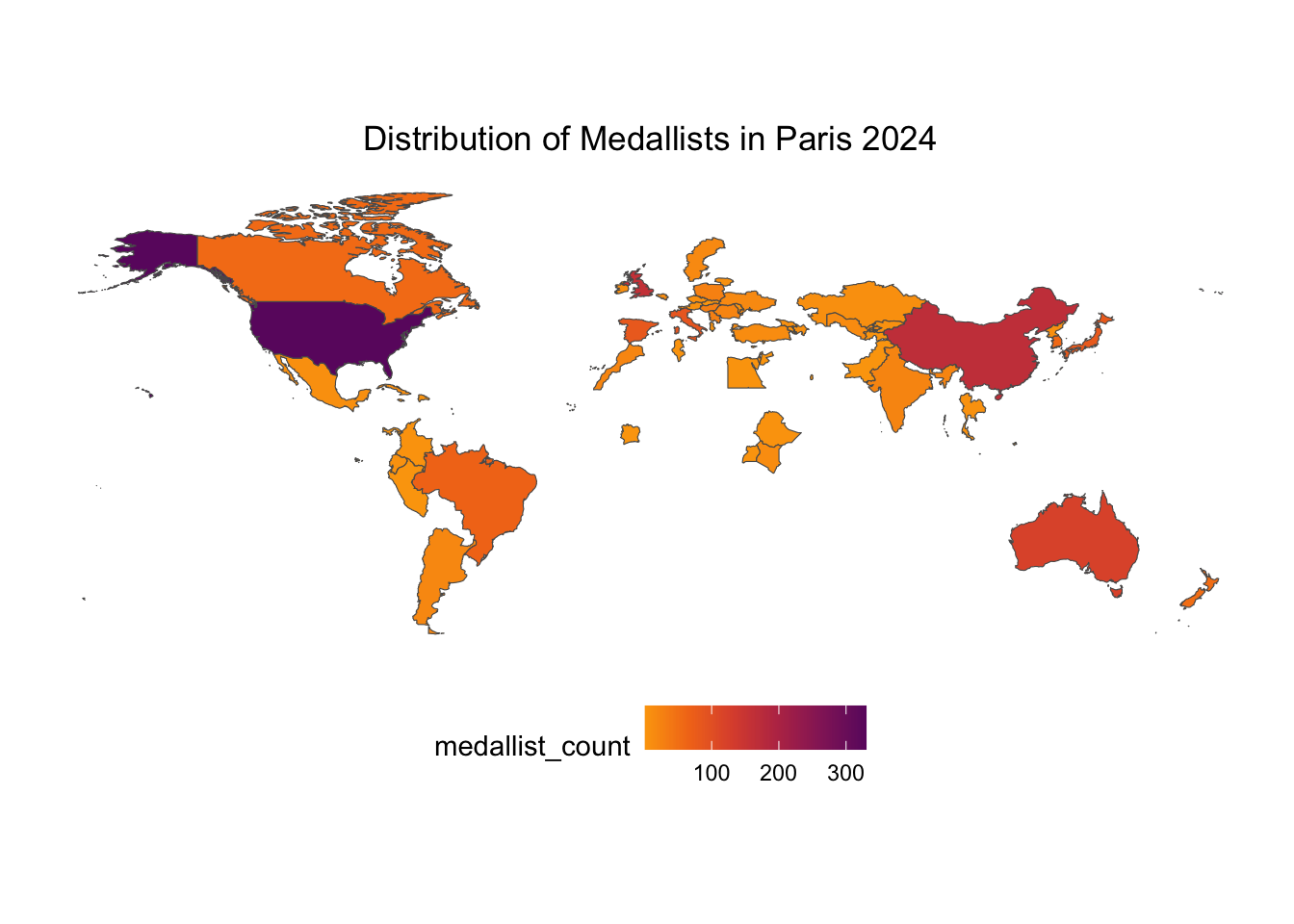
left_join(world, by = c("country_code" = "iso_a3")) |
ggplot() |
ggplot2 |
Create a new ggplot object |
ggplot(aes(x = country, y = medallist_count)) |
aes() |
ggplot2 |
Specify aesthetic mappings (x, y, color, fill) |
aes(x = age, y = medallist_count, fill = medallist_count, geometry = geometry) |
geom_col() |
ggplot2 |
Create a bar chart |
geom_col() |
geom_point() |
ggplot2 |
Add points to a plot (scatter plot) |
geom_point() |
geom_smooth() |
ggplot2 |
Add smoothing line/regression to plot |
geom_smooth(method = "lm") |
geom_sf() |
ggplot2 |
Plot spatial features (map geometries) |
geom_sf(aes(fill = medallist_count, geometry = geometry)) |
coord_flip() |
ggplot2 |
Flip x and y axes |
coord_flip() |
labs() |
ggplot2 |
Add titles, labels, and captions |
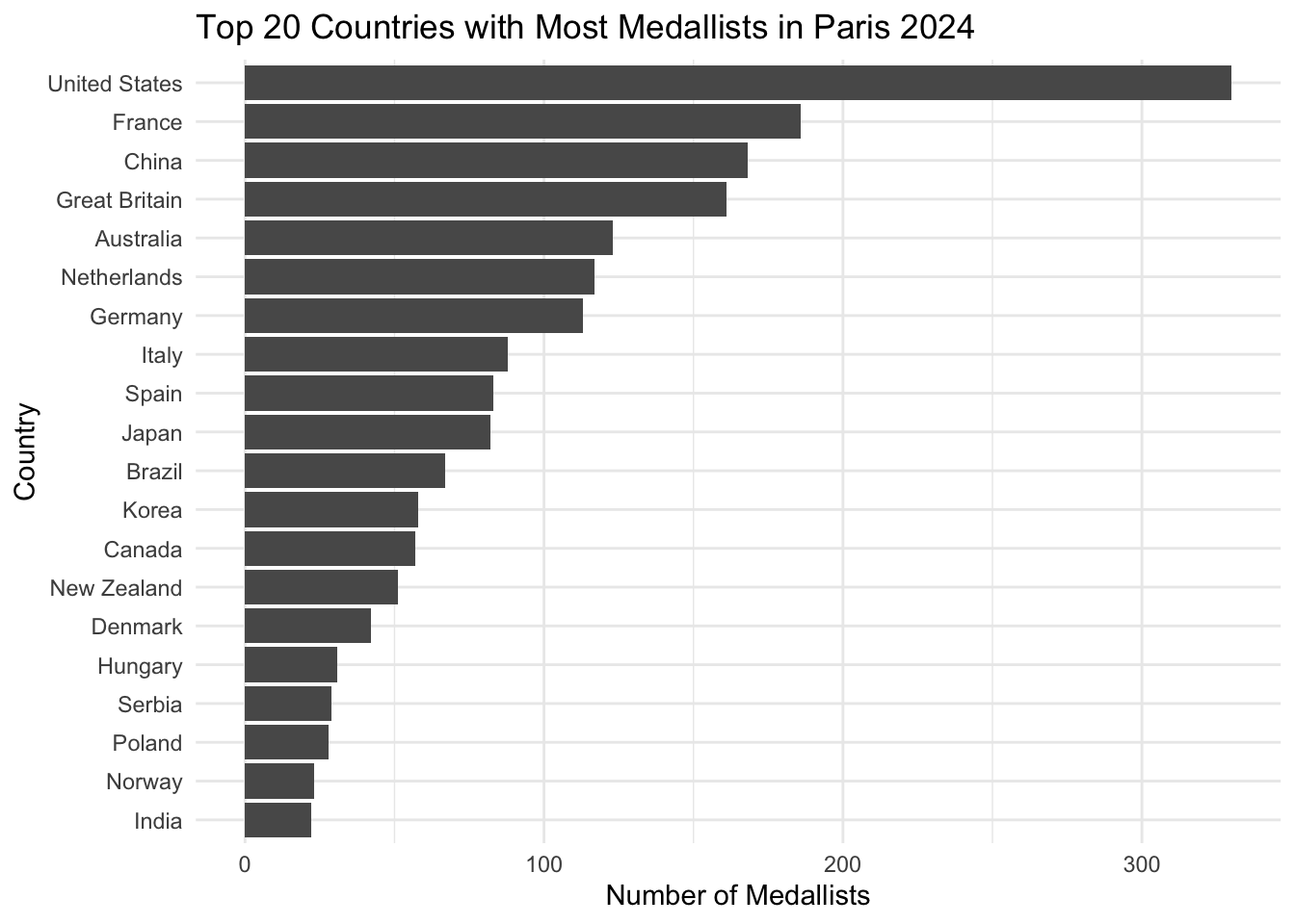
labs(title = "Top 20 Countries with Most Medallists in Paris 2024") |
theme_minimal() |
ggplot2 |
Apply minimal theme |
theme_minimal() |
theme_bw() |
ggplot2 |
Apply black-and-white theme |
theme_bw() |
scale_fill_viridis_c() |
ggplot2 |
Apply viridis continuous color scale for fill |
scale_fill_viridis_c(option = "B", direction = -1, begin = 0.3, end = 0.8) |
element_blank() |
ggplot2 |
Create blank (invisible) element |
element_blank() |
element_rect() |
ggplot2 |
Create rectangle element for backgrounds |
element_rect(fill = "white", colour = NA) |
element_text() |
ggplot2 |
Customize text elements in themes |
element_text(hjust = 0.5) |
theme() |
ggplot2 |
Customize plot appearance |
theme(panel.grid.major = element_blank(), legend.position = "bottom") |
reorder() |
Base R |
Reorder levels of a variable |
reorder(country, medallist_count) |
ne_countries() |
rnaturalearth |
Load world map spatial data |
ne_countries(scale = "medium", returnclass = "sf") |
n() |
dplyr |
Get number of rows in current group |
summarise(medal_count = n()) |