library(tidyverse)

gpfg <- read_csv("data/gpfg_5_years.csv")
world <- read_csv("data/world_boundaries.csv")

gpfg_latest <- gpfg |>
filter(year == 2025)9 Mapping
9.1 Learning objectives
By the end of this chapter, you should be able to:
- decide whether geography is important to a reporting question;
- prepare one value per place;
- match place names to a boundary table;
- check unmatched names before joining;
- build a choropleth map step by step; and
- explain what the map’s colors and missing areas mean.
9.2 When is a map useful?
A ranked bar chart is usually better when the main task is comparing exact country values. A map is useful when location and geographic pattern matter.
Our question is:
Where was the reported market value of the fund’s equity holdings concentrated in 2025?
The question needs country and market_value_usd. To draw country shapes, we also need longitude, latitude, and a polygon group from a boundary table. The analysis and boundary data therefore have to be joined.
To keep this lesson focused on the tidyverse, the course provides a prepared CSV of world boundary coordinates. The coordinates come from Natural Earth; their reproducible preparation is recorded in scripts/prepare_map_boundaries.R.
Continue in the same project
Open djr.Rproj and create 09-mapping.Rmd. Reuse data/gpfg_5_years.csv, then download world_boundaries.csv and save it in data/.
9.3 Step 1: prepare one value per place
The holdings file contains many companies per country. A choropleth map needs one value per geographic area, so reuse the summary pattern from Chapter 5:
country_summary <- gpfg_latest |>
  group_by(country) |>
  summarise(market_value_usd = sum(market_value_usd)) |>
  mutate(market_value_usd_billions = market_value_usd / 1000000000)

country_summary |>
  arrange(desc(market_value_usd_billions)) |>
  slice_head(n = 5)
One row now represents one investment market. Inspecting the five largest values also gives us a table against which to check the finished map.
9.4 Step 2: make place names match
The holdings and boundary files do not always spell a place in the same way. Keep the original country column and create a separate matching name:
country_summary <- country_summary |>
  mutate(
    map_name = recode(
      country,
      "Russia" = "Russian Federation",
      "South Korea" = "Republic of Korea",
      "Türkiye" = "Turkey"
    )
  )
recode() replaces only the listed values. A separate map_name column makes the changes visible and preserves the publisher’s original labels.
9.5 Step 3: check matches before joining
Chapter 8 introduced anti_join() as a diagnostic. Use it again to find investment markets without a matching boundary name:
map_names <- world |>
  distinct(name_long)

country_summary |>
  anti_join(map_names, by = c("map_name" = "name_long"))
An empty result means every source market found a boundary. If names appear, investigate them and add only justified corrections before continuing.
9.6 Step 4: join values to coordinates
Keep the world boundaries on the left so that countries without a reported value still appear on the map:
world_holdings <- world |>
  left_join(
    country_summary,
    by = c("name_long" = "map_name")
  )
Each country has many coordinate rows describing its outline. The join repeats the country’s market value across those coordinate rows so ggplot2 can fill the complete shape. This is expected here; it would not be safe to sum those repeated values after the join.
9.7 Step 5: make the simplest map
First decide what each aesthetic represents:
| Aesthetic | Column | Meaning |
|---|---|---|
| x | longitude |
Horizontal coordinate |
| y | latitude |
Vertical coordinate |
| group | polygon_group |
Points belonging to the same shape |
| fill | market_value_usd_billions |
Reported value represented by color |
Now draw the polygons with only the essential mappings:
ggplot(
  world_holdings,
  aes(
    x = longitude,
    y = latitude,
    group = polygon_group,
    fill = market_value_usd_billions
  )
) +
  geom_polygon()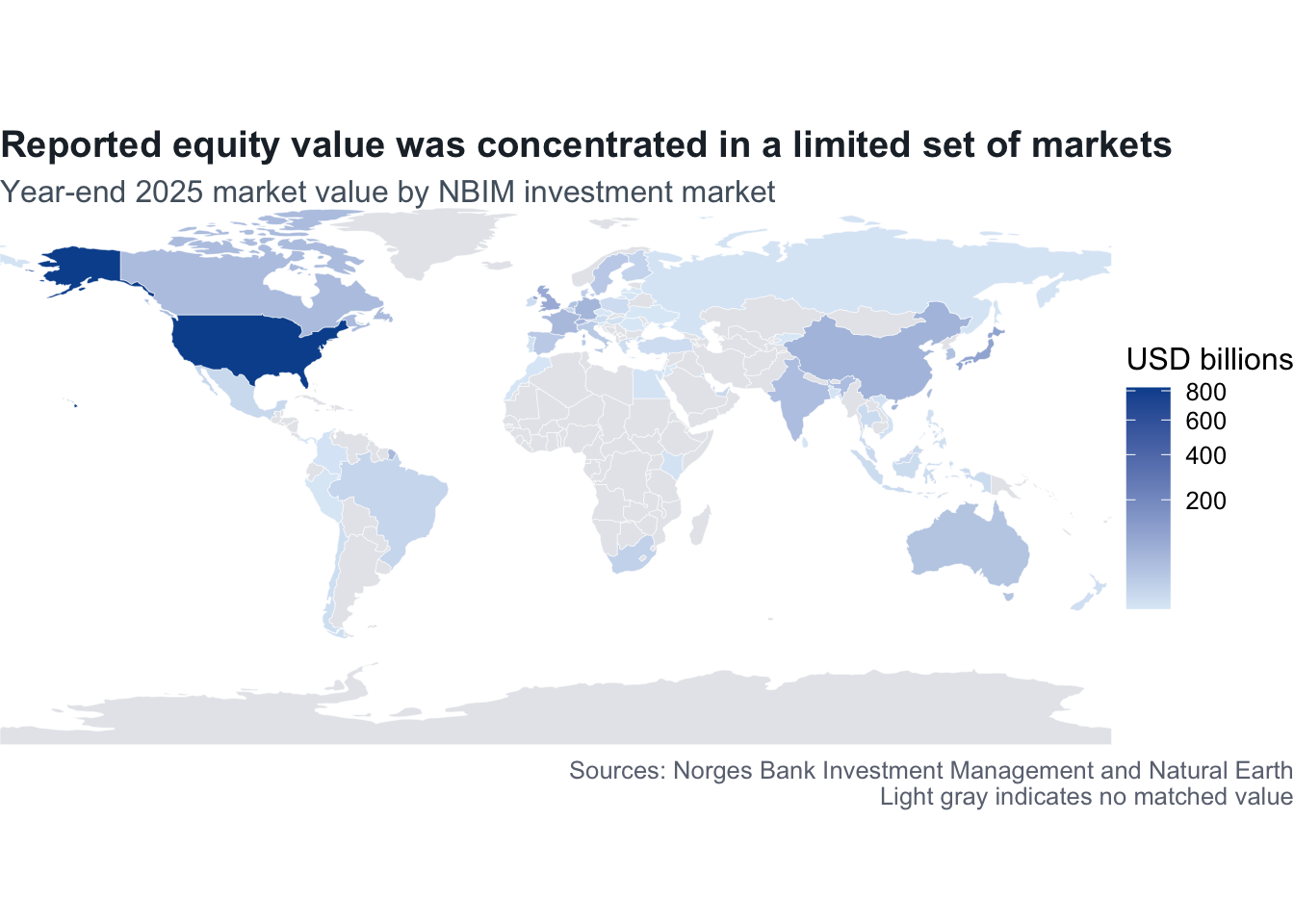
This map works, but the coordinate ratio, missing-value color, and legend need attention before publication.
9.8 Step 6: correct the map shape and borders
Add a map-friendly coordinate system and quiet borders:
ggplot(
  world_holdings,
  aes(
    x = longitude,
    y = latitude,
    group = polygon_group,
    fill = market_value_usd_billions
  )
) +
  geom_polygon(color = "white", linewidth = 0.1) +
  coord_quickmap(expand = FALSE)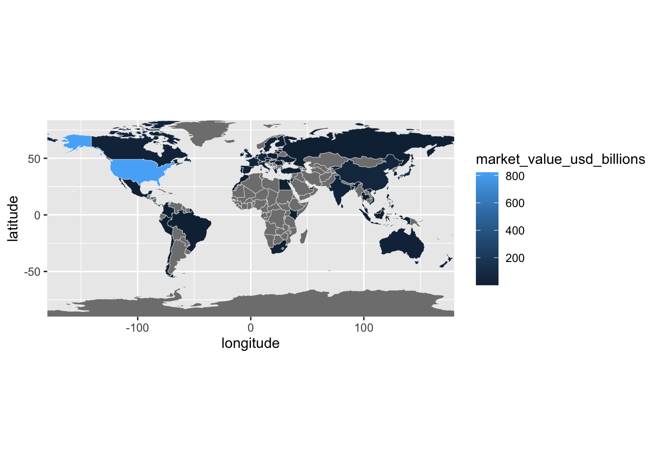
coord_quickmap() keeps the world from being stretched incorrectly. The thin white borders separate neighboring shapes without dominating the data.
9.9 Step 7: choose a meaningful color scale
Market value is a continuous quantity, so use one light-to-dark sequential color scale. Darker blue will mean a larger value:
ggplot(
  world_holdings,
  aes(
    x = longitude,
    y = latitude,
    group = polygon_group,
    fill = market_value_usd_billions
  )
) +
  geom_polygon(color = "white", linewidth = 0.1) +
  coord_quickmap(expand = FALSE) +
  scale_fill_gradient(
    low = "#DCEAF4",
    high = "#006D77",
    trans = "sqrt",
    na.value = "#E6E8EB"
  )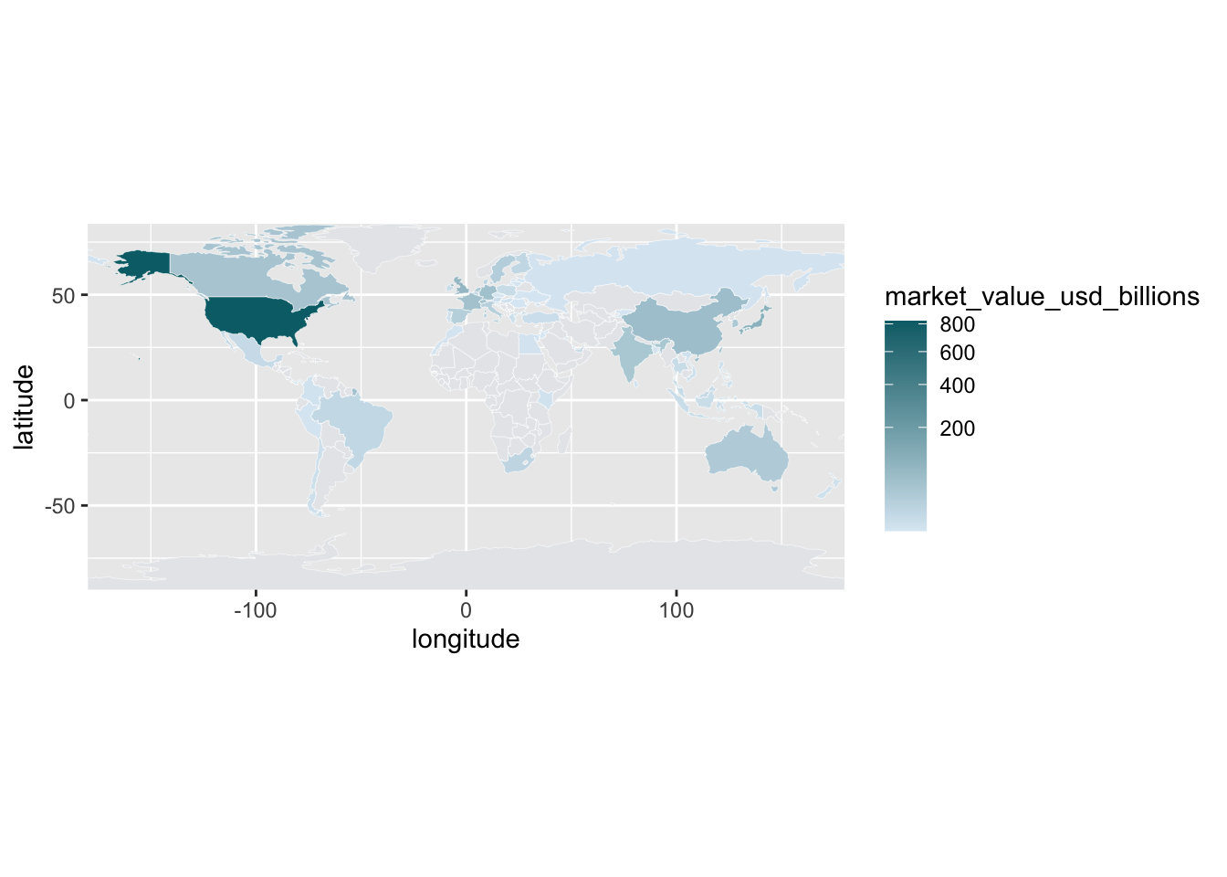
The square-root transformation makes differences among smaller values easier to see without changing the values printed on the legend. Light gray means no matched value in this table; it does not automatically mean zero.
9.10 Step 8: add the story and simplify the design
Finally, add the title, legend label, source, and a minimal map theme:
ggplot(
  world_holdings,
  aes(
    x = longitude,
    y = latitude,
    group = polygon_group,
    fill = market_value_usd_billions
  )
) +
  geom_polygon(color = "white", linewidth = 0.1) +
  coord_quickmap(expand = FALSE) +
  scale_fill_gradient(
    low = "#DCEAF4",
    high = "#006D77",
    trans = "sqrt",
    na.value = "#E6E8EB"
  ) +
  labs(
    title = "Reported equity value was concentrated in a limited set of markets",
    subtitle = "Year-end 2025 market value by NBIM investment market",
    fill = "USD billions",
    caption = "Sources: Norges Bank Investment Management and Natural Earth\nGray indicates no matched value"
  ) +
  theme_void(base_size = 12) +
  theme(
    legend.position = "right",
    plot.title = element_text(face = "bold", color = "#16323F"),
    plot.subtitle = element_text(color = "#52606D"),
    plot.caption = element_text(color = "#6B7280", hjust = 0),
    plot.title.position = "plot",
    plot.caption.position = "plot",
    plot.margin = margin(12, 18, 12, 18)
  )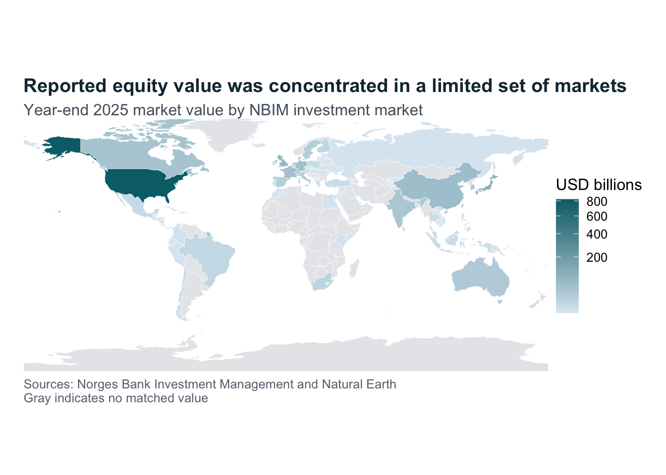
The final version is the same map as the basic one. Each layer solves one communication problem: shape, separation, color meaning, labels, or visual clutter.
9.11 Interpret the map carefully
The map uses NBIM’s investment-market column. It does not necessarily show a company’s place of incorporation, where its workers are located, or where its revenue is earned. Boundary files also contain naming and political choices, so record the boundary source and explain consequential name changes.
The map is good for showing a broad geographic pattern. Use the ranked table when readers need exact values or close comparisons between countries.
9.12 Practice
Create the same map for another year in gpfg_5_years.csv. Submit:
- the filtered annual data;
- the country summary;
- the unmatched-name result;
- the basic and final maps;
- a ranked table of the five largest values; and
- a caption explaining what the colors and gray areas mean.
9.13 Takeaways
| Function | What it does |
|---|---|
recode() |
Replaces selected place names explicitly |
anti_join() |
Finds source places without a boundary match |
left_join() |
Adds the data values to boundary coordinates |
geom_polygon() |
Draws filled shapes from coordinate rows |
coord_quickmap() |
Uses a map-friendly aspect ratio |
scale_fill_gradient() |
Adds a continuous light-to-dark color scale |
theme_void() |
Removes axes and background elements from a map |
Want more control?
The official ggplot2 reference documents more options for polygons, coordinates, themes, and color scales. Start with a clear geographic question and a checked join before exploring additional styling.